

I will update this at least daily.
Sources for data:
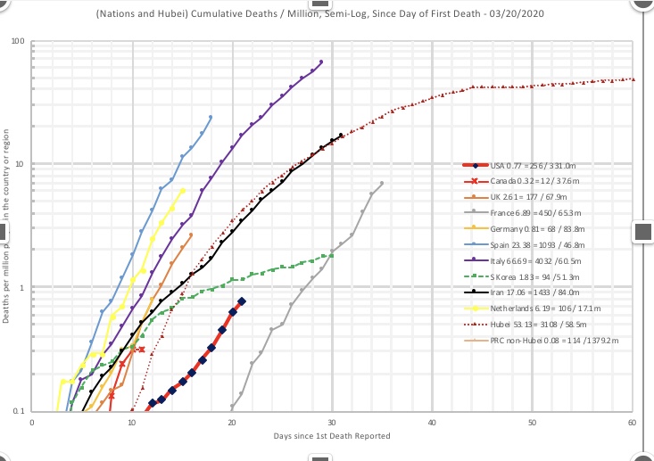
3/20/20
We are at 256 deaths now. It’s still growing exponentially, along with the other Western nations I have plotted. We still remain lower per capita since the first death.
Italy is over 4,000, which is greater than Hubei province and the rest of China—but they seem to be reducing their rate of growth over the last few days. If this trend continues, they will level off at some point—although the death toll will be something like 500 people per million or about 30,000.
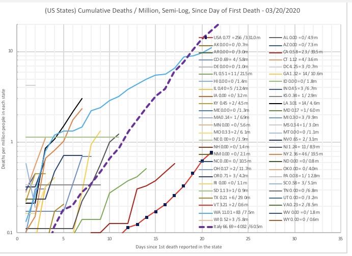
The US states are shown. Washington still leads, but their growth rate is less than Italy’s was at the same time-shifted point. Even though they are still growing, they now have less mortality per capita than Italy at day 21.
We have New York and Louisiana in relatively bad shape. New York is leading in official case count now. But hopefully with social distancing, the curve will bend rightward soon. Governor Cuomo is ordering shelter-in-place and shaming those who would congregate in groups. God bless him and the people of New York. But they will unite and get through this like they got through the 9/11/01 aftermath.
Florida and California, where some of the first deaths occurred nationally, are in relatively better shape, Their population is weighting the national curve toward the good side.
Most other states have less than 5 deaths, so the trends aren’t established yet.
We haven’t seen the effects of the most recent social distancing measures, because it takes 2-3 weeks typically to die from COVID-19 after you get the virus. But in a week or so I hope to see the curves start o shift rightward. Lots of people were taking measures early on anyway. The Italian data gives me some hope.
It is encouraging that Washington’s mortality growth slope is better than Italy’s. Hopefully the other states will follow this trend. Florida and California seem to be.
Everybody should stick with social distancing. When you go out to do your essential tasks, keep 6 feet distance and don’t touch your face if you touch any hard surfaces. Do the best you can.
I am grateful that Trump restricted mainland China immigration in January—that is definitely bearing fruit here. The sealing of both the Canadian and Mexican borders today, and the ban on immigration from various countries in the past 2 weeks, are definitely going to help. We need the virus to get resolved in the bodies of the carriers. It will happen if we all do our part.
Perhaps if we acted earlier we would get stabilized earlier, but no matter what this was going to be a really big deal for everyone, and I view it as an investment in our nation’s future from a geopolitical and economic standpoint. God be with our leaders and with the people, and guide them well.
3/18
So what I am doing is tracking cumulative death toll. I am plotting it on a semi-log plot, time-shifted so that Day 1 is the first day for the death toll to be non-zero in a region. I have adjusted for population size—for each country or region, it’s death per million residents.
The national graph shows the United States against a lot of the Western countries that are currently dealing with the pandemic.
At the time I write this (3/19/20) , the US and the others have death growing exponentially from day to day. On a semi-log scale, when the plot appears linear, that means the toll gets multiplied by a certain percentage each day (over 1, of course). On a linear scale it looks like a rocket trajectory.
I have South Korea in there as well. South Korea appears to have limited the growth in death toll to a linear amount. On the semi-log scale, you see the toll trends flatter and flatter as time goes on.
For China, I have the Hubei province plotted. For the other provinces plotted collectively, the death toll is under 0.1 persons per million and doesn’t appear on my graph, which starts at 0.1.
Hubei province, of course, had exponential growth in death until some time in February, when the sequestration and quarantines were imposed, and the line flattened out, as you can see. South Korea went through the same exercise and is now in the linear growth phase. The western nations have yet to make that turn.
Although the US is growing exponentially with the other Western nations, the per-million time-shifted numbers are much lower than the others. If the quarantines and social distancing work, the slope of that plot should start to lessen in a few days and then get flat. If it does, the death per million will be less than for the other Western nations on the plot.
For this, I think we can credit the immigration restrictions imposed on China in late January, as well as the ones imposed on continental Europe late last week. (Or at least our politicians can.)
I also note that the semi-log slope for the US is currently less than that of the other nations. Although fewer people per capita have gotten tested for the virus in the US than in most of the other nations, I believe that most of the serious cases would have gotten tested. So although the true US case count is probably much higher than the reported case count, the true US death toll is probably very close to what is being reported.
Notes on the other nations:
- Italy (purple) will exceed China’s death toll in absolute terms either today or tomorrow. They are already ahead of Hubei province on a per-capita, time-shifted basis (their population and Hubei’s are both around 60 million). But the graph indicates that the growth rate is starting to decline.
- Spain (blue) exceeds Italy per-capita, time-shifted, but may also be starting to bend.
- France is sort of an outlier—they had death #1 early, on 2/15, and stayed at 1 death a long time before. That death was a Chinese tourist. The second death was 11 days later. If the tourist death is taken out, the whole curve shifts leftward 11 days and gets clustered in with the other ones.
I have some of the US states listed here as well. As of 3/19, the plurality of cases are in Washington state. New York and Oregon may join them in a week, as well as Louisiana. I’ll plot more states later as we get more data.
In the US, we are all being told to practice social distancing nationwide. The better we do at this, the lower the slope will be as time goes on. That keeps the medical system from being overwhelmed and buys time for more people who are quarantined to get back into action safely to combat the spread.
Nobody is going to be perfect at social distancing. The millennials and Gen-Z are getting lobbied not to party, as if they are some kind of mindless horde that don’t care about anything or anyone, but I’d like to think they are making decisions that will collectively help “flatten the curve.”
The ones on Spring Break, for example, should be de-clustering as much as possible—it may be better to spread out on the beach in the fresh air than to coop up in cramped hotel rooms. At the micro level, these folks know what to do. Social media will tell them if they don’t.
It also helps not to be near a “hot spot”—like King County, WA, or NYC, or New Orleans.
I’m also hopeful that the warming weather will decrease the viability of the virus when it is outside the human body. That ought to help a lot.
