
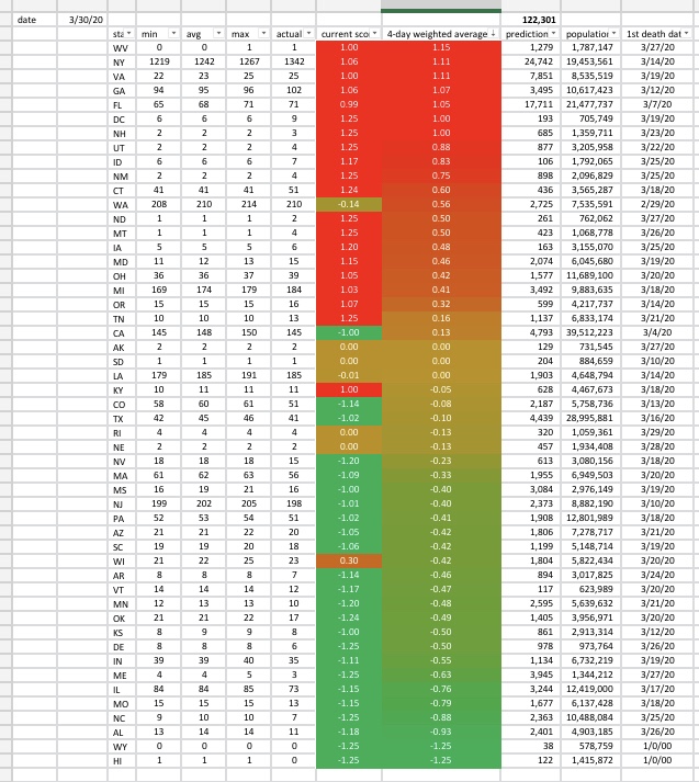
I fit the 3/30 IHME model into my Excel spreadsheet.
Also I had to correct an error in my scoring system. I was getting thousand of dead in states like ND and MT, because the formula was not processing small death tolls properly.
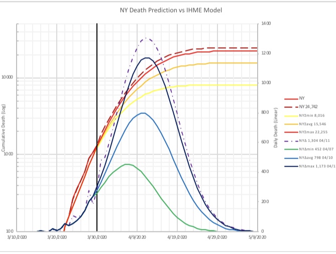
Looks like New York is blowing through the maximum curves (blue for daily, red for cumulative). Not so good—but again, these were put into the pipe some 25 days ago, before most of the city started doing any real mitigation.
Where does mitigation begin to be felt? That will determine if they continue to track the max curves, or shift down toward the average and minimum ones. If New Yorkers started changing their behavior early, you’ll see the actual data start to shift toward the better curves, and the peak daily death will be earlier and with less magnitude.
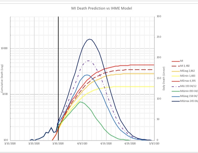
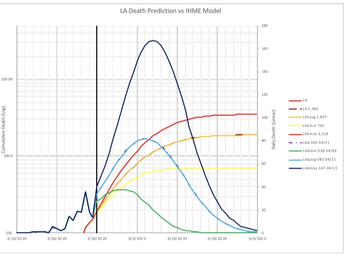
In Michigan, they are midway between average and max. In Louisiana, they are right at average.
As we get updated model data, I’ll download and and we can see the maturation of the models over time. The 3/30 one has less spread in it than the 3/26 one does.

The above is the performance of nations on a per-capita basis.
Most Western nations are doing shelter-in-place, but the mitigation effect of this is just starting to be felt. As time goes on, everybody will flatten. The problem, of course, is how well they will weather their respective medical surges.
In bright rose, bold, is Sweden. At this time they do not have hard shelter-in-place—there are restrictions on large gatherings, but schools are open and businesses can operate to some extent; quarantine of the sick is highly recommended, as well as work-from-home if possible.
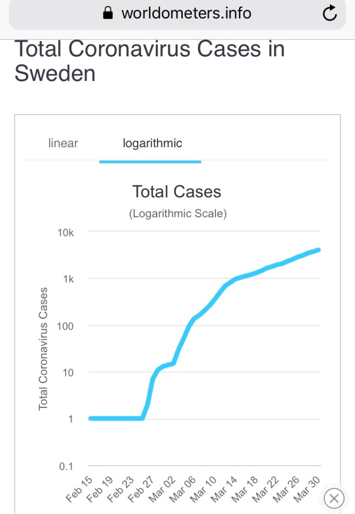
Unfortunately, case count is still rising. Cases tend to reflect the spread rate from a week or so ago, so they may have to tighten the valve a bit in order to reduce case growth.
It will be interesting to watch this, because it may guide us in our prevention strategy in May and beyond.
